
Applique Letter Styles Worth Offering as a Small Embroidery Business
When customers start looking for lettering, they usually know the name or message they want, but they may not know which style will work best on fabric. I have seen this many times while working with applique letters and fonts for shirts, team wear, baby items, and home pieces. A good style choice starts with the item's purpose, fabric, size, and the amount of detail the lettering can handle. These details also shape the applique embroidery digitizing tips I use when reviewing a new lettering request.
For a small embroidery business, the goal is not to keep hundreds of styles ready. A practical selection of dependable styles can cover most customer requests. From classic block lettering to soft script and sporty varsity designs, each style has a place. The key is knowing where each one works best and how much digitizing adjustment it needs before you add it to your service menu.
Why Letter Style Choice Matters for an Applique Business
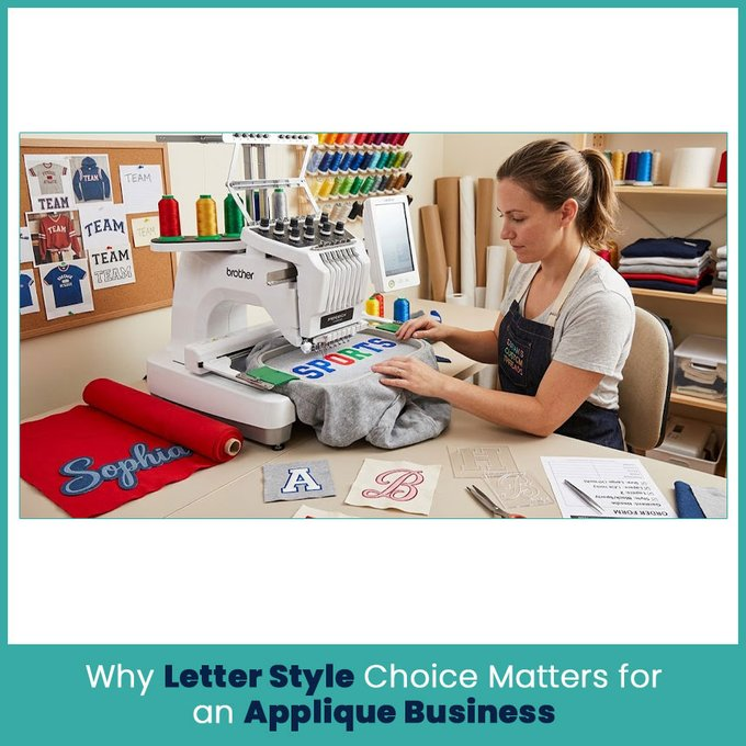
The letter style affects much more than appearance. It can change how much fabric the design needs, how clean the edges look, how long the lettering takes to prepare, and which garments suit the finished piece.
A business can make its choices easier by keeping a few questions in mind:
What item will carry the lettering?
How large will the letters be?
What type of fabric will be used?
Does the customer want a classic, playful, sporty, or decorative look?
Will the lettering use one fabric layer or several?
Does the style contain thin strokes or small details?
What Customers Actually Look for in Custom Lettering
Most customers want lettering that looks good and matches the item. A sports team may want bold, strong characters, while a parent ordering a baby blanket may prefer something softer.
Customers also notice spacing and proportions. Even a good font can look wrong if the letters sit too close together or the word doesn’t fit the available space.
For custom applique letters, I look at the complete design rather than judging the font alone. The letter shape, fabric choice, finished size, and edge treatment all need to work together.
How Letter Style Affects Price and Turnaround
Different styles need different amounts of preparation. A simple block letter usually has fewer complicated areas than a connected script style.
The amount of applique fabric, number of layers, lettering size, and number of colors can also change the preparation time.
For a small embroidery business, keeping these differences in mind helps when explaining pricing to customers. A simple style may need very little adjustment, while a detailed style can require more careful work.
Classic Block Letters for Everyday Applique Orders

Block lettering is one of the most useful styles for a small embroidery business. The shapes are easy to recognize, spacing is usually straightforward, and the broad strokes give the applique fabric enough room.
I have used this style for everything from names on school clothing to large lettering on team garments. Its simple structure makes it practical when the customer wants a clean result without decorative details.
Best Use Cases (Team Names, Monograms, School Wear)
Block letters fit many everyday projects, including:
Team names
School jackets
Monograms
Work shirts
Family clothing
Tote bags
Blankets
Caps and other accessories
The style also works well when customers need lettering that remains readable from a distance.
Why Block Letters are the Easiest to Digitize and Stitch
Block shapes usually provide enough width for clean edge coverage. Their corners and straight sections also give the digitizer clear areas to work with.
That does not mean every block font needs the same settings. A very narrow block font can still create problems at a small size. The final dimensions matter just as much as the original font.
Script and Cursive Letters for a Personalized Look

Script and cursive styles bring a different character to applique lettering. Their connected shapes can create a soft, personal appearance that suits gifts and decorative pieces.
The main challenge comes from the connections between letters. Some script fonts contain thin sections that become difficult to reproduce once fabric and edge stitches enter the picture.
Where Script Works Best (Baby Items, Gifts, Home Decor)
Script works especially well for:
Baby blankets
Personalized pillows
Nursery items
Wedding gifts
Decorative towels
Family name pieces
Special occasion gifts
For these items, customers usually want the lettering to look personal rather than formal.
Digitizing Challenges With Script Letters and How to Handle Them
Script needs closer attention because connected letters can create tight spaces. If the strokes become too narrow, the applique edge may not have enough room for clean coverage.
I check the smallest parts of the lettering first. If a thin connection will not hold its shape at the requested size, I may adjust the letter weight or spacing while keeping the overall character of the font.
That small correction can make a big difference in the finished piece.
Varsity and Collegiate Style Letters

Varsity lettering has a strong connection with school sports, team clothing, and athletic designs. Its bold structure also works well with applique because the larger letter shapes give fabric pieces enough room.
Why This Style is Popular for Sports and Team Apparel
Sports customers usually want lettering that is easy to read and has a strong visual presence.
Varsity styles work well for:
Baseball jerseys
Football jackets
School sweatshirts
Team hoodies
Sports bags
Championship apparel
Club uniforms
The large shapes also give room for layered fabrics and contrasting colors.
Layering Techniques for a Varsity Letter Look
Layered varsity lettering can use one fabric for the main letter and another for an outer section or border.
For example, a dark letter with a lighter outer layer creates a strong contrast. The digitizing plan needs to account for the order of those layers so each section sits cleanly.
I pay particular attention to the outer border because it has to cover the edge of the inner fabric without making the complete letter look too heavy.
Bubble and Puff Letters for a Playful Look
Bubble lettering gives customers a softer and more playful option. The rounded shapes work nicely for children's clothing, casual items, and designs where a bold but friendly appearance fits the project.
These designs need careful planning because rounded letters can take up more space than customers expect.
Best Fabrics and Garments for Puff Letters
Puff-style applique can work well on sturdy garments that can support the added thickness and structure.
Common choices include:
Sweatshirts
Hoodies
Jackets
Heavy cotton shirts
Team apparel
Children's outerwear
The fabric should support the design without causing the letter edges to lose their shape.
Digitizing Considerations for 3D Puff Applique Letters
Three dimensional applique needs more attention to letter width, edge coverage, and material thickness.
Very narrow letters can become difficult because there may not be enough surface area for the raised effect. Rounded and bold characters usually provide a more practical starting point.
Before accepting a detailed puff lettering request, I check the finished size and the material together. A style that looks great at three inches may not work the same way at one inch.
Mixing Letter Styles to Offer More Design Options

A small business does not need a huge font library to give customers variety. Mixing two compatible styles can create a custom look without making the selection confusing.
The important part is keeping the main lettering easy to read.
Pairing Fonts for Names Plus Taglines
A bold style can work well for a main name, while a simpler secondary style can handle a smaller tagline.
For example, a family name might use a bold block style while a short phrase underneath uses a clean, narrow font.
I usually recommend keeping one style dominant and using the second style as support. Too many competing fonts can make even a well-made design look crowded.
Building a Simple Style Menu for Customers to Choose From
A simple style menu makes the ordering process easier. Instead of showing customers dozens of fonts, a business can group its choices into a few useful categories.
A practical menu might include:
Classic block
Script and cursive
Varsity
Bubble
Layered
Decorative
Each category can show a few actual samples at the sizes the business commonly handles.
This gives customers something concrete to compare. It also helps the embroidery business explain which styles suit shirts, team apparel, blankets, gifts, or heavier garments.
A small, well-organized selection can be much easier to manage than a large collection of fonts that rarely get used.
FAQs
Which applique letter style is easiest for beginners to offer?
Classic block lettering is usually the simplest starting point because its shapes are clear, bold, and easier to adapt.
Do different letter styles need different digitizing files?
Yes. Different shapes, sizes, stitch structures, and applique layers can require separate digitizing settings and file preparation.
What letter style works best for baby and kids' items?
Soft script, rounded, and bubble styles can work well for children's items, as long as the lettering stays large and clear enough for the chosen fabric.
Author Bio
Matthew Davis
Senior Embroidery Digitizer
I'm Matthew Davis, a skilled embroidery digitizer with more than 15 years of practical experience. I specialize in logo digitizing, 3D puff embroidery designs, applique digitizing, custom embroidery digitizing, and working with difficult fabrics.
Over the years, I have worked with different fashion brands and production teams worldwide. I always share simple tips and useful techniques to help both beginners and businesses improve their embroidery work.